Ribbon Editor
- The ribbon is a key feature of the lightning interface.
- The Ribbon Editor lets you configure a ribbon.
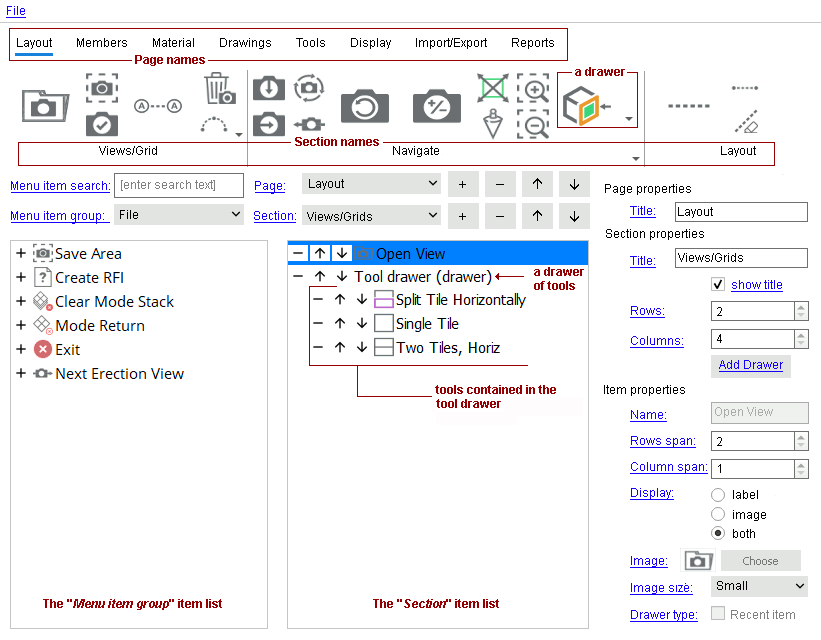
- The Ribbon Editor is a file editor. The type of file it edits is a ribbon configuration file. The ribbon configuration file name in the example below is my_favorite_tools .
Ribbon configuration: my_favorite_tools 

- You can open the Ribbon Editor from the Role configuration tab of the Customize Interface window as described in these step-by-step instructions .
- Once you are in the Ribbon Editor , if you File > Open a ribbon configuration file that is not the " Current role configuration " reported on the Role configuration tab of the Customize Interface window, nothing you do in the Ribbon Editor will affect that role configuration.
- The Ribbon Editor lets you place icons on a particular " Section " of a ribbon " Page ." It can also be used to add ("+") or delete ("-") icons.
- If you File > Save As , your changes will be a part of the " Current role configuration " currently loaded to the Customize Interface window only if your save overwrites a ribbon configuration name that is a part of a role that is associated with that currently loaded role configuration.
- The same ribbon configuration file may be used by multiple roles and role configurations. If you File > Save the changes you make to the ribbon configuration file that is currently loaded in the Ribbon Editor , your changes will be replicated across each role in each role configuration file that incorporates the currently loaded ribbon configuration file.
- Beginning in v2021i, you can configure contextual pages -- that is, pages that only appear when you are performing certain actions. You save your configurations into contextual configuration files which reside outside of roles and role configurations. Consequently, assigning a ribbon configuration file to a contextual page or editing that file will have the same effect on the page regardless of the " Current role configuration " currently loaded, and regardless of which role is active.
- See (on this page):
Also see :
- Customize Interface ( Ribbon Editor is opened from)
- Ribbon configuration ( Ribbon Editor can edit one such file at a time)
- Role configuration file (may contain multiple roles)
- Role switcher (each role has an associated ribbon configuration file)
- A role (may be assigned 1 ribbon configuration, but other roles may have the same ribbon config)
- Lightning role configuration (role configuration file loaded when, for example, Modeling is launched)
page 1 | contents | customize interface > ribbon configuration > edit
What is the ribbon?
The ribbon is a key feature of the " Lightning " user interface. You can open the Ribbon Editor to place icons onto the ribbon as described here . The ribbon becomes a feature of the Modeling user interface when Home > Utilities > User and Site Options > " Layout style " is set to ' Lightning '. The ribbon is customizable, and all customizations that you make are stored in a ribbon configuration file. The Ribbon Editor 's File > menu lets you save, rename and create new ribbon configurations.
|
|
The ribbon is highly customizable. This illustration shows just one page in a multi-page ribbon configuration. The " Layout " page of this configuration is the active page. Each ribbon configuration is stored in a ribbon configuration file. |
- You can create your own ribbon pages. You access a page by clicking its tab.
- You can edit ribbon pages to place the icons on them so that you can easily access the tools that you prefer.
- Some pages are contextual . That is, they only appear when you are performing certain actions.
- For example, when you add a construction line in Modeling , a Locate page appears that presents point locators, modifiers, and other ribbon items that are useful when adding construction lines. If User and Site Options > General > " Auto switch to selection context ribbon page " is checked (
 ), the Locate page is switched to automatically. When you've finished adding the construction line, the Locate page disappears from the ribbon.
- For example, when you add a construction line in Modeling , a Locate page appears that presents point locators, modifiers, and other ribbon items that are useful when adding construction lines. If User and Site Options > General > " Auto switch to selection context ribbon page " is checked (
- You can remove non-contextual pages.
- You cannot remove contextual pages, however.
- Non-contextual configurations are parts of roles , which are collections of ribbon, keyboard, and context menu configurations. Roles belong to role configurations .
- Contextual ribbon configurations reside outside of roles and role configurations. Changes you make to them have the same effect on the ribbon in every role configuration.
page 1 | contents | customize interface > ribbon configuration > edit | top
To add an icon to a non-contextual page section :
The Ribbon Editor must be opened via the Customize Interface window, which is a role configuration editor. This is a typical procedure for adding an icon to a particular " Page " and " Section " of the particular role configuration that is loaded to Customize Interface . The role configuration that is loaded to Custom Interface from Home is the role configuration you select before the Custom Interface window opens. The role configuration you edit from Modeling is User and Site Options > General > " Lightning role configuration ."
1 . You can open the Ribbon Editor at Home or from Modeling . This step explains how to choose a ribbon configuration for editing.
|
At Home : 1) Choose Utilities > Customize Interface . 2) Select a role configuration file to customize from the list. 3) The Customize Interface window opens. On the " Role configuration " tab, either select a role or create a new role. 4) Click
In Modeling : 1) Role switcher > ' Customize... '. 2) The Customize Interface window opens. On the " Role configuration " tab, either select a role or create a new role. 3) Click
2 . Now that you are in the Ribbon Editor , you can optionally select a different " Page " and " Section " or add a new page and section. To add an icon to the selected " Section ," you can do the following:
2a : Select a " Menu item group " that contains an icon that you want to add to the ribbon (for instance, select ' File ').
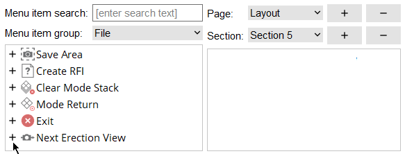
2b : .Press the "+" button next to the icon that you want to move to the section. As a result, the icon will move from the " Menu item group " list to the " Section " list. Note that the icon and its name is automatically selected in the section list, making it simple for you to change its " Name " or " Row span " or " Column span " or etc.
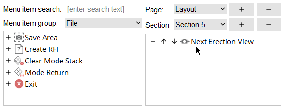
Alternative to 2a: If you know the name of the icon, you can enter its name to " Menu item search " instead of selecting a group.
3 . Repeat step 2 as required to configure the ribbon. You may want to periodically File > Save .
4 . File > Quit or press the  button to close the Ribbon Editor . If you made changes since your last File > Save , a dialog opens to give you the option to save or not. Click ' Yes ' to save your work to the currently loaded ribbon configuration file. Click ' No ' or ' Cancel ' to remain in the Ribbon Editor .
page 1 | contents | customize interface > ribbon configuration > edit | top
To add an icon to a contextual page section :
Follow the steps adding a non-contextual section, with exceptions as noted:
1 . Open the Ribbon Editor . Instead of selecting a " Ribbon configuration " on the " Role configuration " tab, click the " ...Contextuals " tab that corresponds to the environment (e.g. Modeling , Drawing Editor ) whose contextual page you want to edit. Then click to select a file for a ribbon page configuration (e.g. " Locate ").
2 . Add icons to the ribbon page. You cannot select a different " Page " to edit.
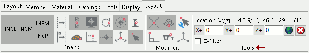
Note: Sections appear on some contextual pages that cannot be added, removed, or edited using Ribbon Editor -- for example, the ' Tools ' section on the ' Layout ' contextual page, which contains offset tools .
3 . Repeat step 2 as required to configure the ribbon. You may want to periodically File > Save .
4 . File > Quit or press the button to close the Ribbon Editor .
To add a single drawer of tools to ribbon section :
1) Select a " Section ." 2 ) Under its Section properties , click the " Add Drawer " button. 3) With the drawer's name in the " Section " item list, click the add (+) button next to an icon to add it to the drawer. 4) Optional: Edit the Item properties to change, for example, the drawer's " Row span " and " Column span ." A drawer of tools can be relocated with arrow buttons, removed with its remove button, or given a new " Name " just like any other ribbon menu item. 5) Optional: By clicking " Choose ," select an icon which to represent the drawer on the ribbon.
The File menu :
|
If all you want to do is edit the " Ribbon configuration " that is selected on the Custom Interface window, you don't even need to use the " File " menu . Just click the button when you are done making your changes. You will be given the option to save your changes (" Yes ") or discard your changes (" No ").
|
File > New empties the Ribbon Editor of all user configurable content. At this point no actual new file is created. If you add new content, for example, create a new page, a new section, then add an icon as described here , then File > Quit , you will then be prompted to give the file a name.
File > Open lets you open a different ribbon configuration file. If you are in Modeling or want the ribbon configuration to be used for Modeling , you should select the file from the
ribbon_menus/Modeling folder. Be aware that making changes to that file does not affect the current ribbon configuration that you have entered to " Ribbon configuration " in Customize Interface . Unless the file you open is exactly the same as the " Ribbon configuration " file, you will immediately see a totally different layout (pages, icons, etc.) here, in the Ribbon Editor .
Ribbon configuration:
my_favorite_tools File > Save As lets you save any changes you have made on this window ( Ribbon Editor ) to a file that you name. That file than becomes the current file in the editor. If you make changes and choose to save, you will not be changing the " Ribbon configuration " in Customize Interface that you selected to open the Ribbon Editor . In the dialog that opens, navigate to, for example, the
File > Save at any time to save any changes you have made to the ribbon configuration.
File > Quit is a direct alternative to pressing the
page 1 | contents | customize interface > ribbon configuration > edit | top
------ General settings ------
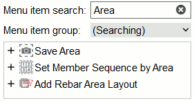
Menu item search: A string (case insensitive) that you enter to search for items. Items that match part or all of the string populate the Menu item group list; and can be added to a " Section " within a ribbon " Page ."
|
A search for Area or area or AREA finds all instances of tools in the database with the string "area" (case insensitive) in its name. Save Area is from the group ' File '. Set Member Sequence by Area and Add Rebar Area Layout are in other groups. |
To add an item to a section, clicking the "+" button next to the item as described here .
Menu item group: 1) Select a group to see the icons and names of the items in that group. 2) Press the "+" button to add the menu item to the selected " Section " of the ribbon.
Note: If an entry has been made to " Menu item search ," group selection is disabled, since entering a search string can find menu items from multiple groups.
Page: The name of the page of the ribbon that you want to edit. This is the name the tab that you click to open the page in the ribbon. All pages that are currently available in the ribbon configuration are shown in the " Page " list box (  ). You can change the name that is selected here by changing its " Title ." This applies when editing a non-contextual configuration -- you cannot change the title of a contextual page.
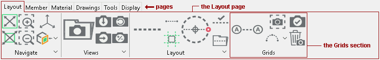
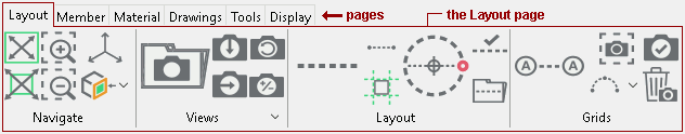
In the following example, the selected page is named ' Layout '.

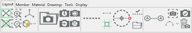
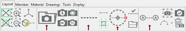
In the following example of the actual ribbon (not the Ribbon Editor ), the " Layout " page is one of six pages. The other five pages are named " Member " and " Material " and " Drawings " and " Tools " and " Display ."

Adds a new page. You can give the page a different " Title " if you like. Adding a new page automatically selects that page in the " Page " list box ( 
Removes the selected page from the ribbon (permanently if you save your changes). The page is removed from the " Page " list box ( 
Moves the selected page's tab to the right. 
Moves the selected page's tab to the left.
Section: The name (at least 1 character) that you want to select to, for example, place icons on . This is the name that, when " show title " is checked ( ), labels the section in the ribbon page. All sections that are currently available in the ribbon configuration are shown in the " Page " list box ( ). Changing to a different " Section " updates the " Section " items list to show the items that are actually in that section. You can rename the selected section by changing its " Title ." To add items to or remove them from the selected section, see the step-by-step instructions .
In the following example, the selected section is named ' Layout '.
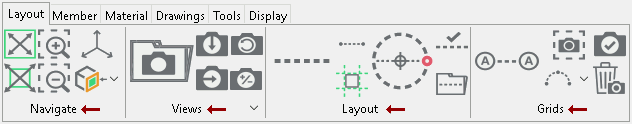
In the following illustration of the actual ribbon (not the Ribbon Editor ), the " Layout " section on the " Layout " page is one of four sections, each with "
Adds a new section. You can give the section a different " Tittle " if you like. Adding a new section automatically selects that section in the " Section " list box ( Removes the selected page from the ribbon (permanently if you save your changes). The page is removed from the " Page " list box ( Moves the section to the right. Moves the section to the left.
------ Page properties ------
Title: The name (at least 1 character) of the selected " Page " that you are editing. This applies when editing a non-contextual configuration -- you cannot change the title of a contextual page. The name you enter here labels the tab on the ribbon that opens the page. The following example of a ribbon has pages named " Layout " " Member " " Material " " Material Drawings " " Tools " and " Display ."
------ Section properties ------
Title: The name (at least 1 character) of the ribbon " Section " that you are editing. When " show title " is checked ( ), the name you enter here appears within the section on the ribbon, below the menu items that have been added to it. The following example of a ribbon has sections named " Navigate " " Views " " Layout " " and " Grids ." Those sections are parts of the page that is named " Layout ."
|
show title |
|
|
 show title show title |
|
If this box is checked (
If the box is not checked (
Rows: The number ( 1 or 2 or 3 ... ) of rows in the selected " Section ."
In the following illustration of the actual ribbon (not the Ribbon Editor ), the sections are named " Navigate " " Views " " Layout" and " Grids ." The number of "Rows" in each of these sections is '2'.
Note 1: If the number of menu items exceeds the number of spaces provided by " Rows " and " Columns ," the remaining items can be accessed by clicking the launcher along the bottom of the section.
Note 2: A menu item can span multiple rows.
Columns: The number ( 1 or 2 or 3 ... ) of columns in the selected " Section ." If the number of items exceeds the number of spaces provided by " Rows " and " Columns ," the remaining items can be accessed by clicking the launcher along the bottom of the section.
In the following illustration of the actual ribbon (not the Ribbon Editor ), the number of "Columns" is ' 3 ' in the " Navigate " and " Views " and " Grids " sections. The number of " Columns " in the " Layout" section is ' 4 '.
Note 1: If the number of menu items exceeds the number of spaces provided by " Rows " and " Columns ," the remaining items can be accessed by clicking the launcher (
Note 2: A menu item can span multiple columns.
------ Item properties ------
Name: A label for the item that is selected in the " Section " item list . This applies if " Display " is set to ' Label ' or ' Both .'
Row span: The number ( 1 or 2 or 3 ... ) of section rows that the item selected in the " Section " item list spans. An item cannot span more " Rows " than are available in the section.
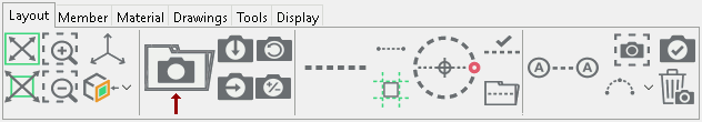
In the following illustration of an instance of the actual ribbon (not the Ribbon Editor ), the Open View icon (
) is set to have a " Row span " of ' 2 '.
Column span: The number ( 1 or 2 or 3 ... ) of section columns that the item selected in the " Section " item list spans. An item cannot span more " Columns " than there are available in the section.
In the following illustration of an instance of the actual ribbon (not the Ribbon Editor ), the Open View icon (
Display: Label or Image or Both .
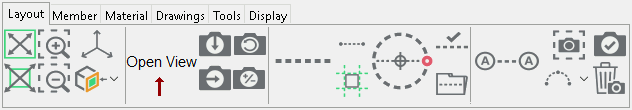
| " Display " for Open View is set to ' Label ' |
|
|
" Display " for Open View ( ) is set to ' Image '
|
|
|
When ' Label ' is selected, the menu item is labeled on the ribbon by the " Name " chosen for it.
When ' Image ' is selected, the menu item is represented on the ribbon by an image. If that item is a tool, it will be represented by the item's icon. When adding a drawer , you can select an image that represents the tool.
' Both ' labels the tool and places an icon next to the label.
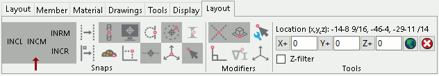
Tip: If you are editing the ' Locate ' contextual page, selecting ' Label ' will display only the standard abbreviations for point locators -- for example, "INCL" for Intersection of Construction Line .
Image: read-only or an image that you choose .
If that item is a tool, this is a ' read-only ' view of the tool's icon. When " Display " is an ' Image ' or ' Both ,' this icon represents the tool on the ribbon.
If that item is a drawer for which " Recent item " is not checked, click " Choose " to select an ' image ' to represent the drawer on the ribbon.
Image size: Small or Large . This indicates the size that the " Image " displays on the ribbon.
In the following instance of an actual ribbon (not the Ribbon Editor ), " Image size" is set to ' Large ' for Open View (
) and Construction Circle Add (
) and Add Grid Line (
). All other tools on the ribbon have their " Image size" set to ' Small '.
Note: Doubling the image size does not double the number of " Rows " or " Columns " that the menu item takes up in the ribbon section. To do that, change the " Row span " and/or the " Column span ."
Recent Item: or . This applies when the item is a drawer .
If this box is checked (
If the box is not checked (
page 1 | contents | customize interface > ribbon configuration > edit | top

